Shoreline Lacrosse
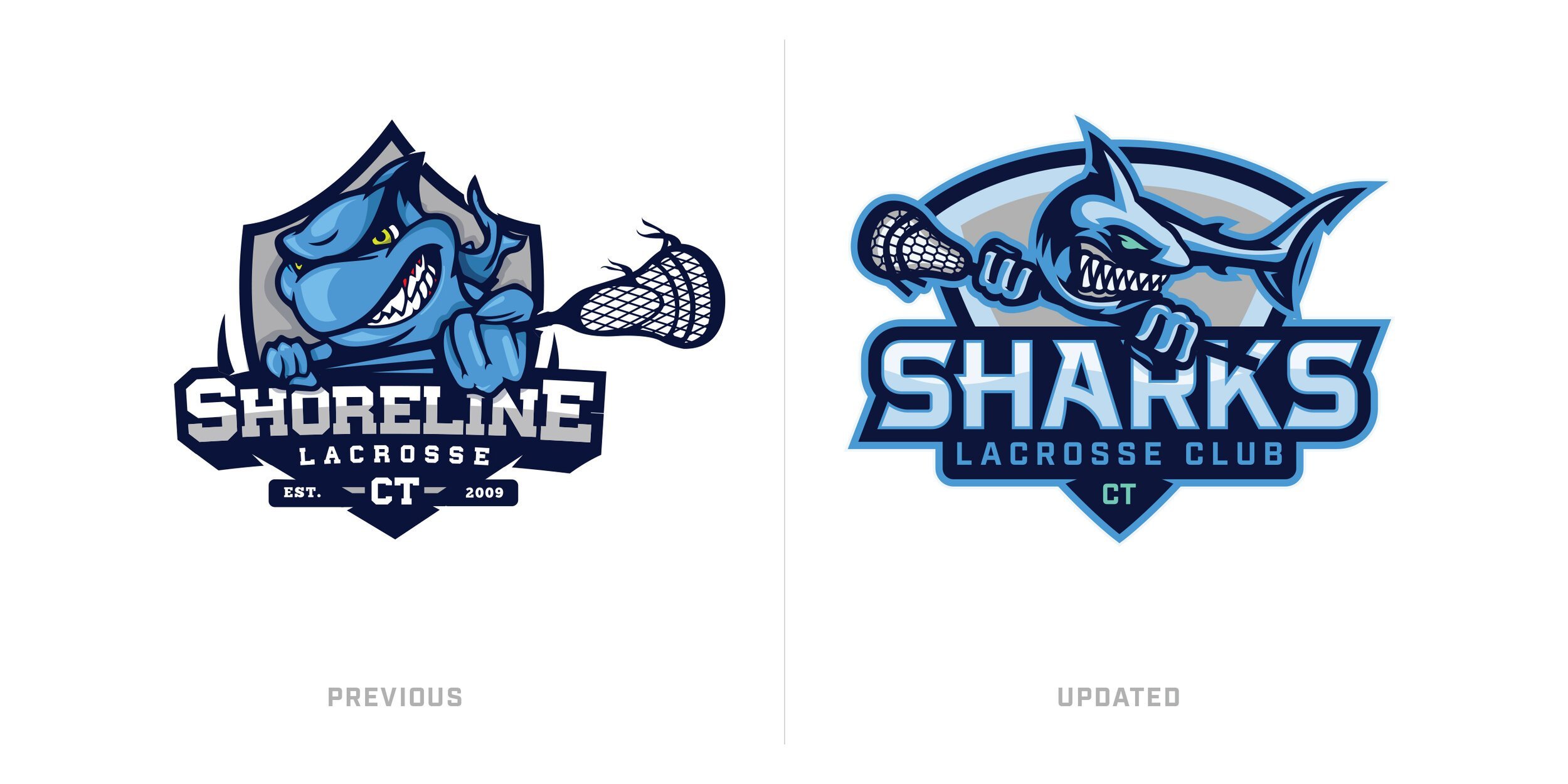
I had an opportunity to live up to the name “Design Shark” on this project haha. I was excited to work with Shoreline Lacrosse on their Shark Lacrosse Club rebrand (Along with refreshing their Shoreline visual identity after the conclusion of the Sharks club, so they could be more cohesive and work in tandem). Shoreline Lacrosse is the primary brand of the business and Sharks Lacrosse is the club team under Shoreline. Working with Nate Wheeler in particular as my point of contact was a great experience. Shoreline Lacrosse began by offering boys and girls camps in Southeastern Connecticut. Since then Shoreline Lacrosse has expanded from Southeastern CT throughout the state and now offers year round CT-Shoreline Sharks Club Lacrosse Program, a wide range of Hybrid Skills-Focused Clinics, and their Town League Consulting Platform.
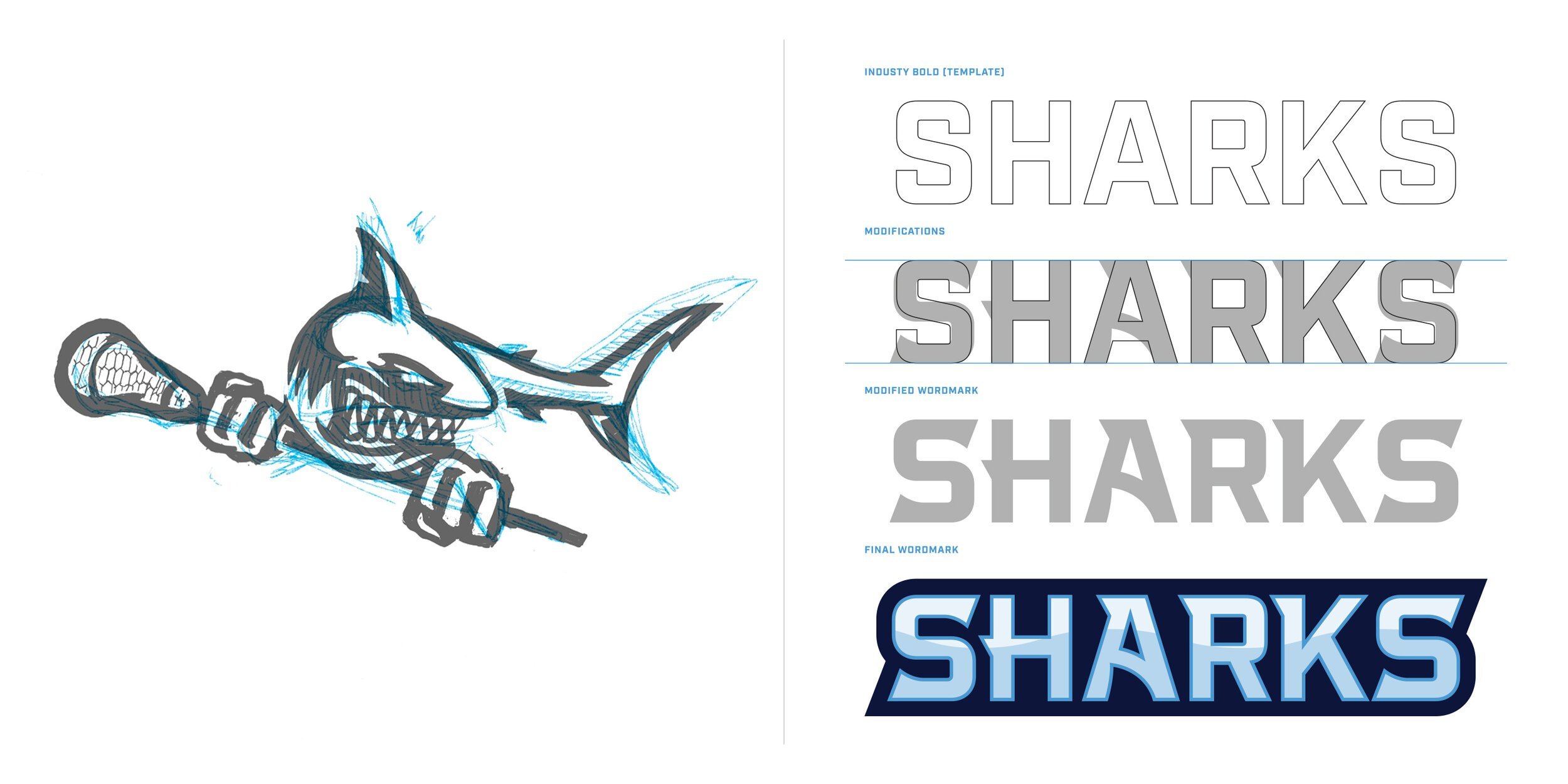
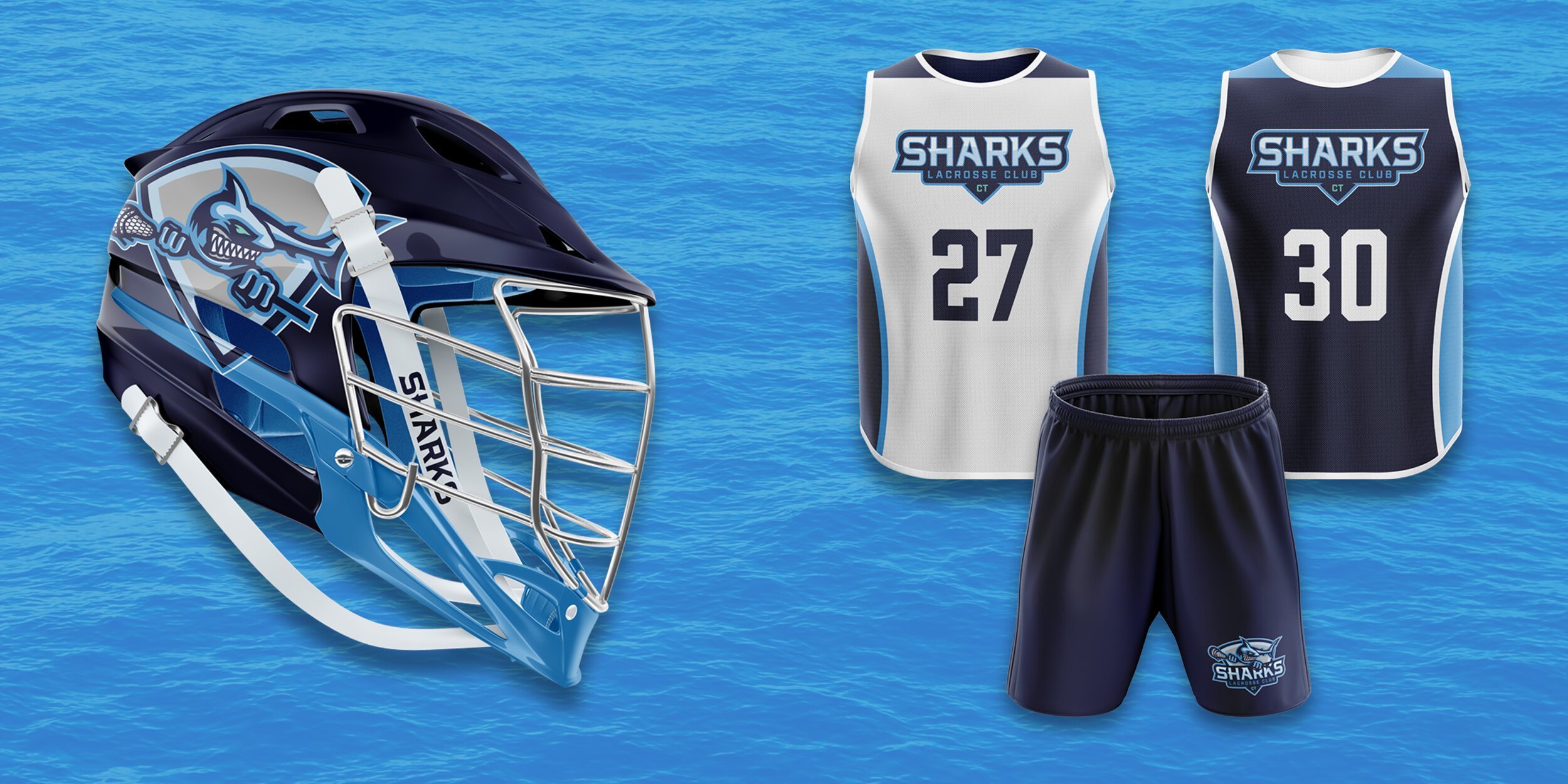
I was tasked with updating the logo and create visual assets that supported the Shoreline Lacrosse brand. The goal was to modernize the shark while maintaining core elements the club wanted to keep in-tact: overly aggressiveness, humanized features and a cartoonish tone. With that in mind, as a 90’s child I immediately thought of the cartoon “Street Sharks” which I used as inspiration.
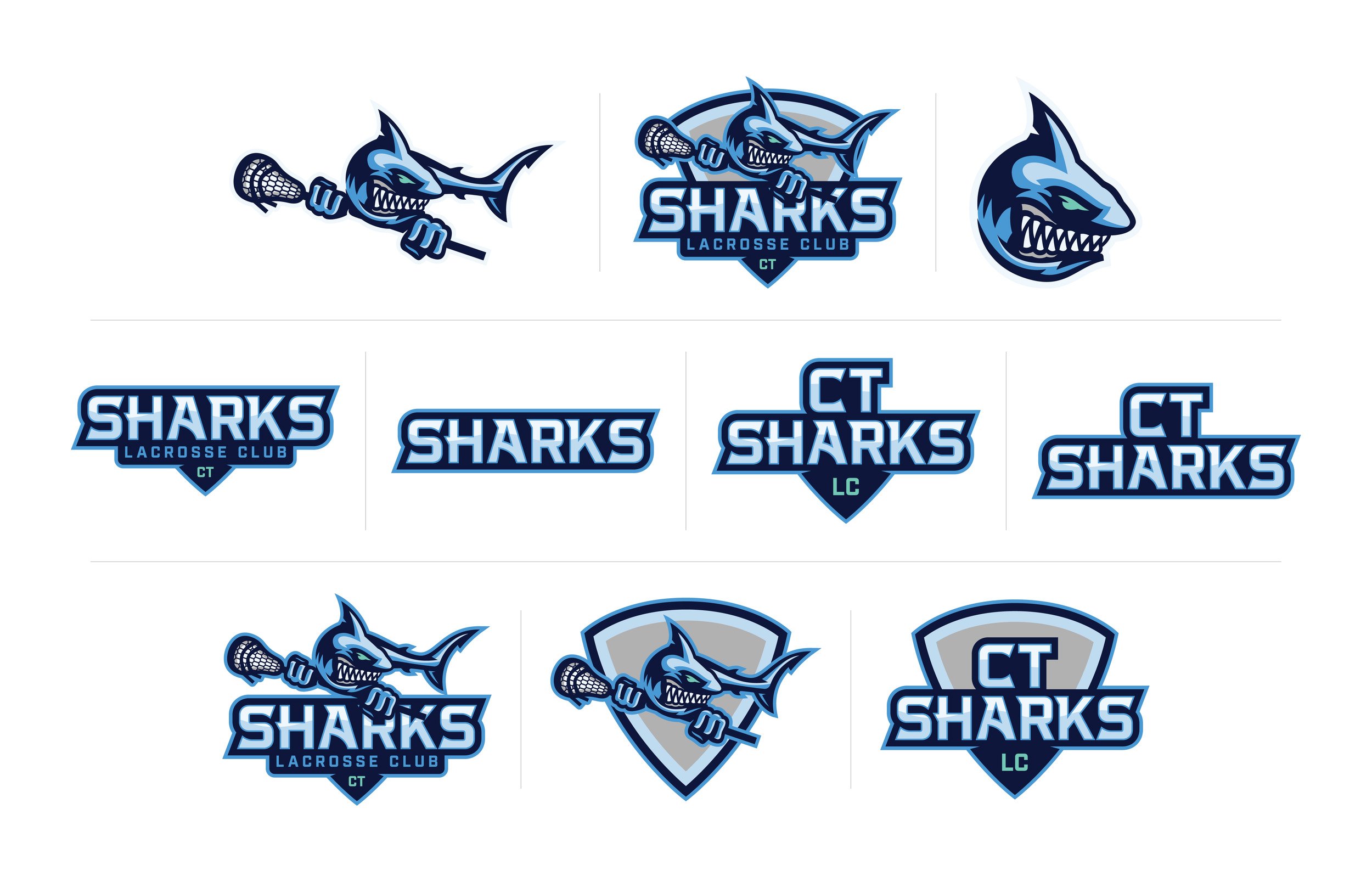
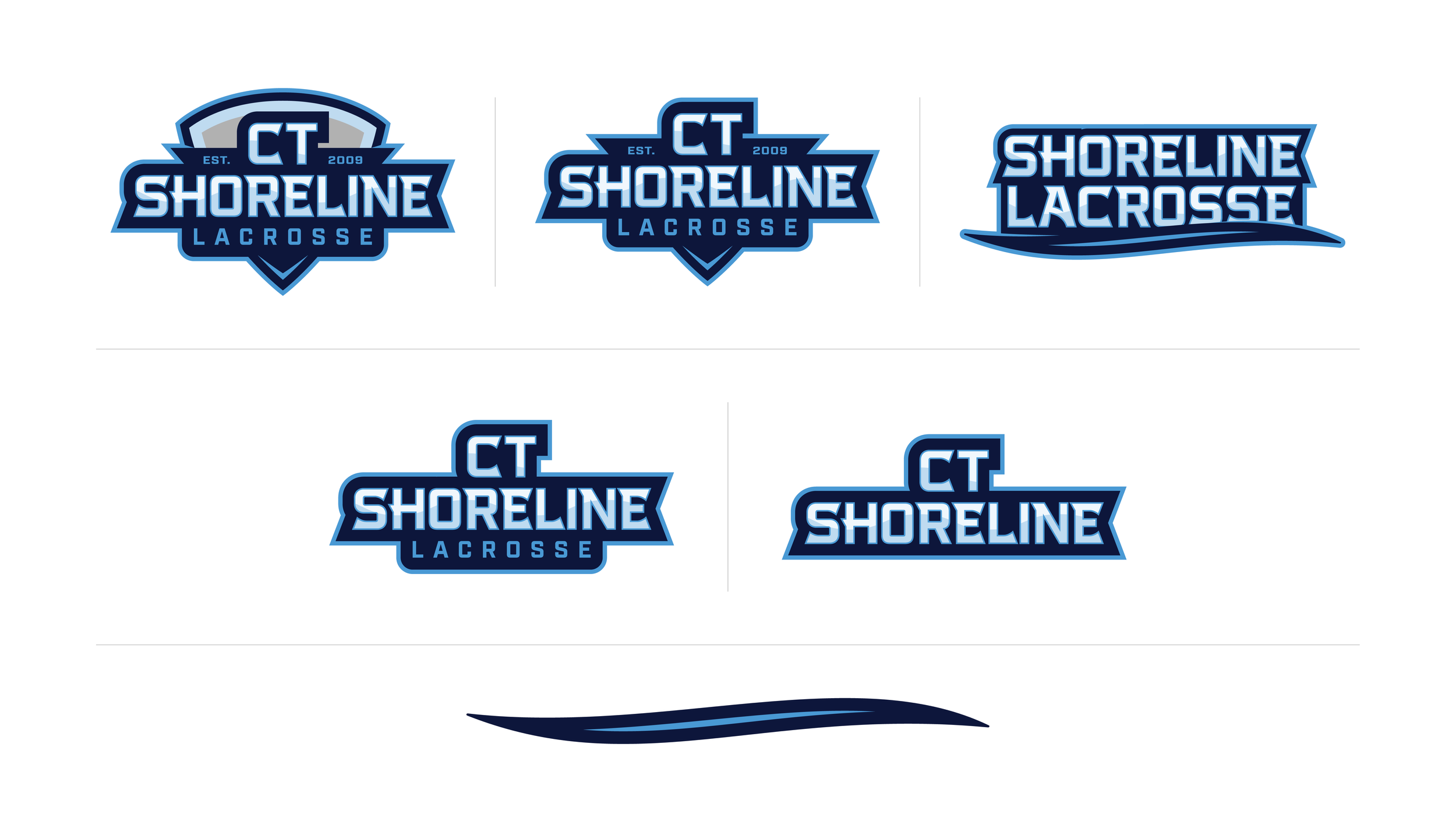
After the Shark was finalized, I collaborated with Nate to come up with a new custom wordmark, shield design and other fresh assets to support the new direction. In the end, I created quite a few mark configurations to make sure the visual identity is flexible enough that it can be used in every situation that is required.
– Project Scope
Discovery & Research
Mascot Development
Club Team Logo System
Custom Wordmark
Shoreline Logo System
Brand Color Palette
Athletic Brand Style Sheet